Using Color Contrasts throughout the Ages
For ages, artists have intuitively used color contrasts for dramatic effect. Michelangelo Buonarroti (1475-1564) was a colorist of great originality and extravagance. On the Sistine Chapel ceiling, Michelangelo modeled by varying color (cangiante) to an unprecedented degree – shifting hues by combining colors to create mid-tones and light tones – for example, adding yellow highlights to an orange robe.
He created shot hues, a term derived from shot silk, where threads of different color are used as weave and cross-weave. The color of the silk varies according to the angle of view. This was unexpected in an artist who was admired for his draughtsmanship (see entry on Michelangelo and the “Doni Tondo.”)

The dynamic shot hues of Michelangelo’s draperies give the figures great intensity. Detail of one of the Damned who is beginning to move downward towards hell. |

The Libyan sibyl twists herself to lower a heavy book onto a shelf. Her pose is as ornamental as the cangianti colors used to model her drapery. |
In northern Spain, medieval artists used color in original, contrasting ways. Note the strongly contrasting yellow and red in the illustration to the right. These stylized illustrations date from between the 10th and 12th centuries at a time when Spain bordered the Arab world. They were rediscovered in the 1920s by artists like Pablo Picasso and Fernand Léger.
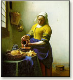
In The Milkmaid, Vermeer uses pure yellow and blue — yellow on the front of the maid’s yellow bodice, where it catches the light, and blue on the top of her apron. These contrasting colors dominate the painting, defining the space and light. The yellow bodice is a source of light, illuminating her face and cap. The blue is strongest in the shadowed apron and less vivid in the tablecloth.
Leonardo da Vinci describes color contrast, in particular the simultaneous contrast of complementary colors, as follows:
“Of different colors equally perfect, that will appear most excellent which is seen near its direct contrary blue near yellow, green near red: because each color is more distinctly seen when opposed to its contrary than to any other similar to it.”

