Simultaneous Contrast
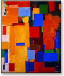
Equinox, Hans Hofmann, 1958. Note how the contrasting colors create energetic forms, which Hofmann famously termed “push and pull.”
Two colors, side by side, interact with one another and change our perception accordingly. The effect of this interaction is called simultaneous contrast. Since we rarely see colors in isolation, simultaneous contrast affects our sense of the color that we see. For example, red and blue flowerbeds in a garden are modified where they border each other: the blue appears green and the red, orange. (This is explained below.) The real colors are not altered; only our perception of them changes. This effect has a simple scientific explanation that we will uncover.
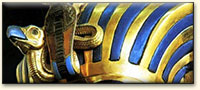
Mummy cases of ancient Egypt were inlaid with gold and blue lapis.
Impressionist interest in color and light is influenced in part by the research of scientists like Michel Chevreul. Specifically, the idea that an object of any given color will cast a shadow tinged with that of its complementary color and tinting neighboring colors in the same manner influences Impressionists. This theory was already known to earlier painters, such as Eugène Delacroix. A primary color such as red has green (the combination of the other two primaries) as its complementary. Similarly, blue has orange and yellow has purple as a complementary color.
Artists have always explored the effects of juxtaposing complementary colors, even without understanding it in neurophysiological terms. Few artists have dramatically used complementary colors as has Vincent van Gogh (1853-1890), illustrated below. Both works were painted in Arles in 1888.
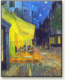
Yellow and blue accentuate each other in van Gogh’s Café Terrace on the Place du Forum, Arles, 1888. |
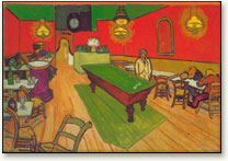
Red and green accentuate each other in van Gogh’s Night Café in Arles, which was painted the same month as the café at left. |
Our sensation is the most intense where two extremes are juxtaposed. Van Gogh’s Night Cafe composes colors described as “warm,” which are generally associated with such sensations and emotions as energy, joy, love and festivity. In his letter to his brother Theo, van Gogh considers the work as “…one of the ugliest (pictures) I have done… I have tried to express the terrible passions of humanity by means of red and green.” By using color in this manner, van Gogh exploits the psychological capacities of colors to arouse emotions (first noticed by Alberti; see introduction), here intentionally creating a jarring unpleasant sensation for the viewer. Contrast this with the entry on Picasso and his “Blue Period,” where the paintings arouse emotions more usually associated with “cold” colors, such as sadness and a withdrawn quality.
Another question to ponder! What other elements in the painting of “The Night Cafe” both as regards color and manner of painting, convey this idea that it is not a pleasant painting of the sort of place most people go to for enjoyment? Yet: the other painting: ‘Cafe Terrace..’ does not have the effect, despite blues being predominant colours?
Simultaneous contrast applies not just to sight but also to the senses of touch and taste. Jumping out of a sauna into a cold pool accentuates the coldness. Drinking orange juice after eating pancakes and sweet maple syrup accentuates the acidity of the juice.
To explore contrasts, point at the colors, below left.
Simultaneous contrast in sight is readily understood. Consider an intense beam of blue light, surrounded by white light, striking our retinas. Where the blue light strikes, the blue cones will be stimulated, overloaded and fatigued. The horizontal cells that link the blue cones will cause blue cones, outside of but close to the blue beam, to also become fatigued. In the surround of the blue beam where the white light falls, the blue receptors will be fatigued and the white light will appear to our brain as yellow. (Recall that blue light plus yellow light equals white light.) Simultaneous contrast causes the white around the blue to seem yellow. Similarly, white light around a yellow beam will seem blue. Such effects are simple to demonstrate with a light beam and some colored filters. Finally, for blue alongside yellow, the blue makes the yellow more yellow and the yellow makes the blue more blue. Simultaneous contrast has its greatest effect for adjacent complementary colors.
Simultaneous contrast affects every pair of adjacent colors. For our example of the red and blue flowerbeds, the red bed makes the blue bed seem green because it induces its complementary color, green, in the blue bed. The blue bed makes the red bed seem orange because it induces its complementary color, yellow, in the red bed.